
Page Contents
ToggleMobile Friendly Website Designs
In today’s digital age, people have become more dependent on mobile phones than desktops or laptops to use internet. Whether it is to browse social media, shopping online, reading blogs or booking services – smartphone has now become the main device.
This behavior of users has created an urgent need for businesses to invest in mobile friendly website designs for businesses.
If your website is not optimized for mobile users, you may lose a large part of potential customers. In fact, studies suggest that now more than 60% of the global website traffic comes from the mobile device.
What is a responsive design?
Responsive designs is one that looks good on smartphones and tablets and works correctly. It adjusts its layout, button, text and image according to the small screen.
Here is told whether the thing makes a Mobile Friendly Website:
- Responsive design: The layout changes depending on the screen size.
- Easy navigation: menu and buttons are simple and easy to use.
- Fast loading: Pages open faster, even if the mobile network slows down.
- Readable text: Fonts are much larger to read without zoom.
- Clean layout: There are no clutter, pop-up or very small links.
In short, it is about creating a website despite the device that gives a positive user experience.
Why responsive website design are important
1. Increasing mobile usage
Today most internet users like to browse on mobile devices. If your website is not mobile friendly website, then visitor can go immediately (high bounce rate). On the other hand, responsive website design help users to maintain users by providing an easy and professional experience.
2. Better search engine ranking
Google has already changed mobile-first indexing, which means that it mainly sees its mobile version while ranking your site. A response and mobile friendly website design directly improves your SEO performance, which increases the chances of your search result on the first page.
3. Fast Load Time
The websites optimized for mobile are light and rapidly loaded. Since mobile users often browse on slow connections compared to desktops, fast plays a big role in keeping them pairs. A well-designed mobile site can reduce the time of loading and can increase the user’s satisfaction.
4. More conversion
Whether you run e-commerce business or provide services, mobile-friendly website increases design conversion. A clear design in appearance that shows call-to-action buttons, simple forms and optimized checkout processes make it easy for customers to complete their buyer or inquiry.
5. Faith and brand creates image
A modern, response website shows that your brand cares for user experience and remains with trends. Websites not only disappoint users but also leave a negative impression about your business.
Principle of effective responsice website
Creating a responsive web design is not just about technical changes – this is a design philosophy. Here are some necessary principles to follow:
-
Mobile Friendly Website Designs Framework
Use CSS Media Query and Flexible Grid to adjust your layout for different screen size. Framework such as bootstrap or tailwind CSS can speed up the development by maintaining continuity. -
Prefer content
On mobile, less is less. Highlight the most important content first. Use users shrinking sections, arbitrary and brief heading to guide users. -
Optimize image and media
Large images slow down mobile sites. Compress visuals without renunciation of quality. Use SVG for icons and lazy loading for non-mating media. -
Make navigation easier
Change the complex menu with hamburger icons or bottom navigation bar. Ensure that the button is quite large for the thumb and the link is at the right distance to avoid the click accidentally. -
Test on all devices
Do not depend only on the amulator. Test your site on real device - Android, iOS, Tablet - to catch real -world problems.
Different types of Resposive website designs
You can see diffrent image of mobile friendly website and get idea for your business and you can also visit our portfolio for webpage which are developed by Droff Designs. By focusing on mobile-first design strategies, you can create a website that not only attracts the visitor but also turns them into loyal customers.
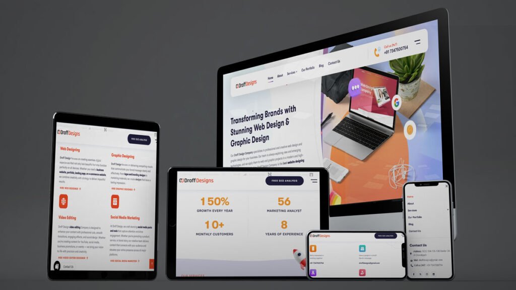
Droff Designs is a website design, graphic design and video editing company. The design and layout of this website is suitable for all devices (desktops, tablets and mobiles), so that users can get excellent experience on every platform.
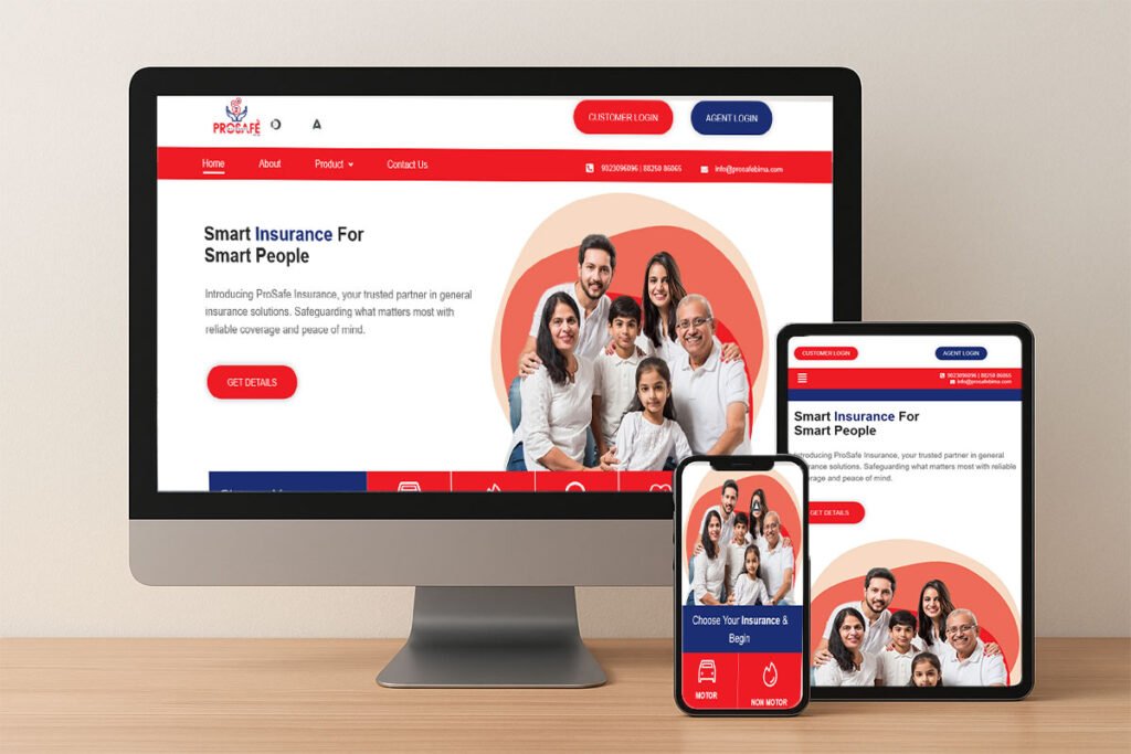
Prosafe is the website of an insurance company. Its layout is designed in such a way that it provides a perfectly favorable and user-interest experience on all devices (desktops, laptops, tablets and mobiles).
The biggest task in such a website is how to make it Mobile Friendly Website, so that the website looks good on every device and the user can easily understand its content. The site from the response is visible correctly on mobile, tablet and desktop – everything, which improves the user experience.
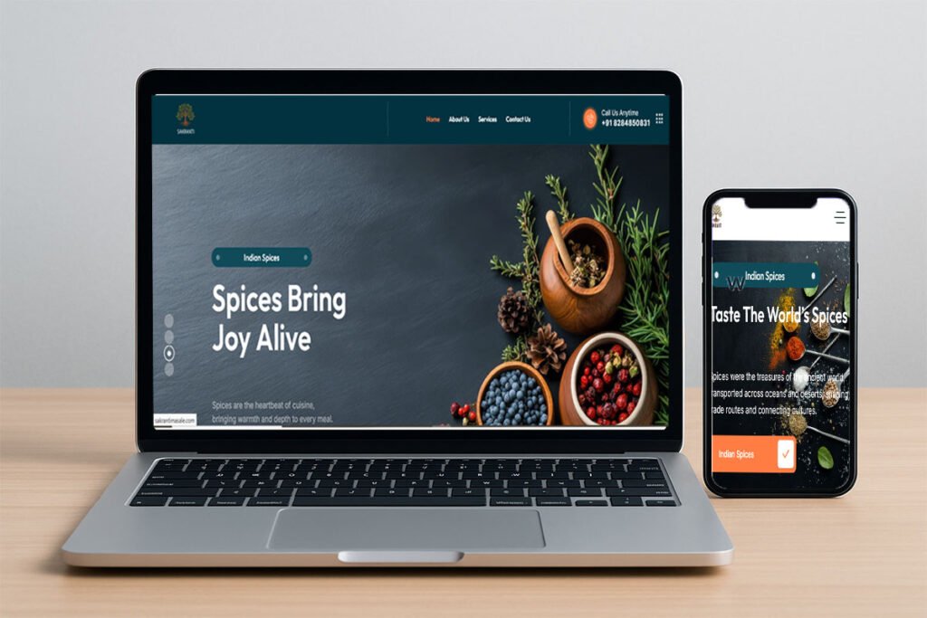
Sakranti Maske is a corporate website, whose design is designed in an attractive and professional manner. In this, products are presented clearly and effectively, so that the user can easily understand them and use them better.
Future trends in mobile friendly websites
Mobile Friendly Website is developing rapidly. Here are some trends to see:
- Voice Search Optimization: Due to more users talking to their phone, content should be structured for natural language
2. Dark Mode Compatibility: Providing dark mode improves user convenience and accessibility. related questions.
3. Progressive Web apps: These are the best mix of websites and apps, which provide features like offline access and push notifications.
4. AI-operated Personalization: Mobile sites will rapidly mold according to the user behavior in real-time.
Conclusion:
In today’s era, where mobile usage is dominated on the Internet, not having a mobile friendly website designs is a big disadvantage. From better search engine rankings to more customers satisfaction and better conversion, responsive websites provide countless benefits to all size businesses.
Whether you are a startup, a small business, or a big enterprise, to ensure that your website is responded, faster and user -friendly on all devices, is no longer alternative – this is a requirement. You can also take suggestion for your responsive website. And contact us for develop any kind of website.